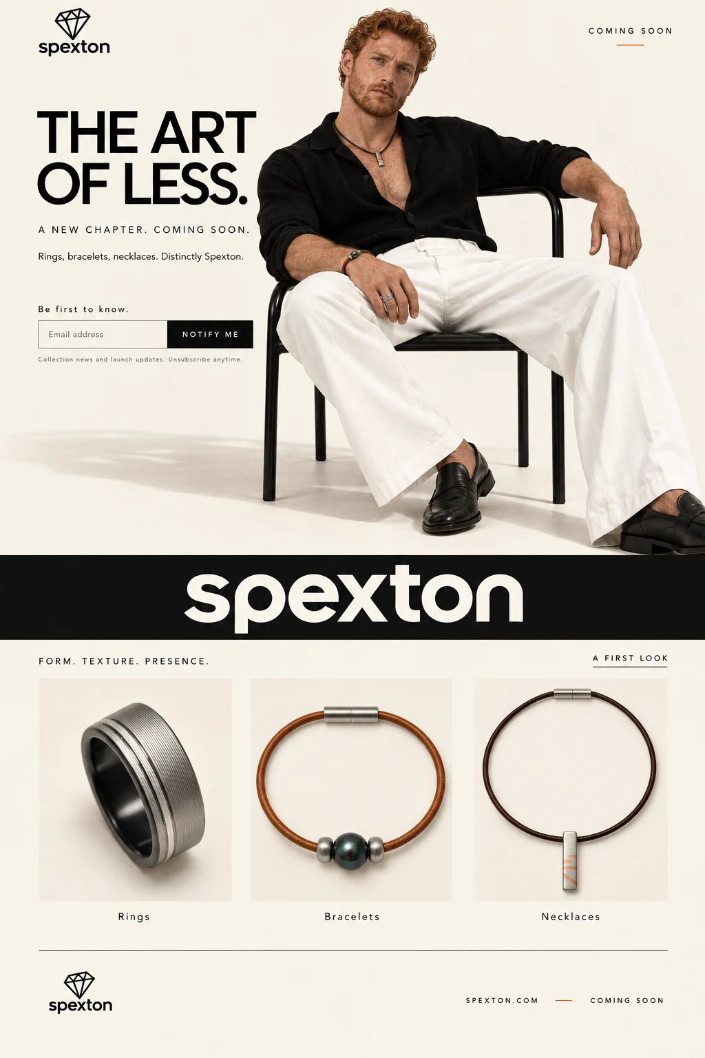
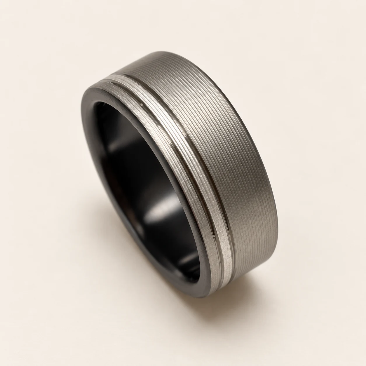
Selected relaunch visual direction: an early website concept and AI-assisted product imagery. The concept image is not a screenshot of the current storefront.
The product is only part of the experience.
Custom jewelry asks customers to make detailed decisions: material, width, size, engraving, and timing. The website needs to communicate those details while preserving the character of the brand.
For the Spexton relaunch, I developed a restrained visual direction around the idea of ‘The Art of Less’ and worked through the relationship between editorial imagery, product presentation, and the shopping experience.
My contribution.
I co-founded Spexton in 2003 and continue to own and operate the brand. That experience gives me firsthand knowledge of the questions, production details, and service expectations behind a custom order.
For this relaunch work, I set the visual direction, supplied product knowledge and dimensional requirements, reviewed imagery, and directed AI-assisted Shopify changes. I evaluated the result as both a brand owner and a customer.
Brand direction
E-commerce UX
Product requirements
Art direction
Quality review
From first impression to a confident order.
Brand direction becomes useful when it carries all the way through the purchase: what someone sees, what they understand, what they choose, and what arrives at their door.
01
Set the tone.
Editorial imagery introduces the brand. Consistent cream backgrounds and a restrained palette let customers move from a campaign image to a product page without feeling as though they have entered a different store.
02
Show the actual piece.
Product images need to explain scale, material, finish, and construction. I supply measurements and references, then review the result against the jewelry rather than accepting an attractive image on appearance alone.
03
Guide the choices.
A ring and a leather necklace ask different questions. I define the relevant sizing, length, engraving, and packaging requirements for each, then work through whether the options and add-to-cart behavior support that order.
04
Set expectations beyond checkout.
Production timing, fit guidance, care information, and packaging complete the experience. These details help someone understand both the purchase and what happens next.
The decisions that shaped it.
Give the product room to speak.
A consistent cream background, restrained typography, and a narrow palette create continuity between products. I reviewed metal tone, reflections, shadows, and jewelry proportions so the visual treatment stayed connected to the physical piece.
Make customization easier to follow.
Accessory options are organized around the decisions a customer actually makes: length, leather, and packaging. Ring sizing and engraving need their own logic. I directed corrections to option ranges and the add-to-cart experience.
Make the details part of the design.
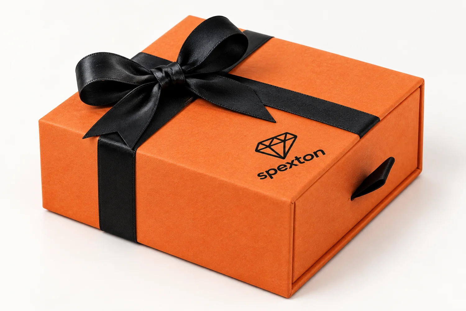
Production timing, sizing guidance, care, and the brand story belong in the experience. I worked across those touchpoints and explored packaging that continues the same visual language after checkout.
Packaging exploration, created with AI from the product reference and brand direction.
A closer look
A beautiful image still has to be the right image.
Image review became a detailed part of the work. A metal finish could look too light, a reflection could make a polished surface appear damaged, or a piece could look oversized on a model. Each issue needed a specific correction, not simply another request to make it look better.
I used product dimensions, reference photographs, and side-by-side visual judgment to direct changes to metal tone, reflections, background color, shadows, and placement. That same attention carried into product options: the correct length range or a functioning add-to-cart action matters as much as the visual treatment.
What I review before calling it ready.
Does the imagery represent the material, finish, and proportions of the real piece?
Can a customer understand the required choices and the expected production time?
Do the available options match what can actually be made and ordered?
Do the product page, brand story, and packaging feel like the same business?
A coherent foundation for the relaunch.
A defined visual direction across editorial imagery, product presentation, and packaging concepts.
Shopify product-option work and a brand-story page prepared as part of the relaunch.
A clearer relationship between the brand’s visual identity and the practical details of ordering custom jewelry.
Where it stands
The relaunch is in preparation. These examples show design and implementation work; they do not claim a measured increase in conversion or sales.
How I used AI.
I use AI to explore visual directions, develop imagery from references, and assist with implementation. My contribution is the brief, brand judgment, product knowledge, requirements, review, and iteration. Generated imagery is reviewed against the real jewelry before use.
What I bring to the next project.
My experience making and selling jewelry gives me a way to judge the whole purchase. I can translate a visual direction into practical requirements and spot where a polished presentation still leaves a customer with an unanswered question.